0%

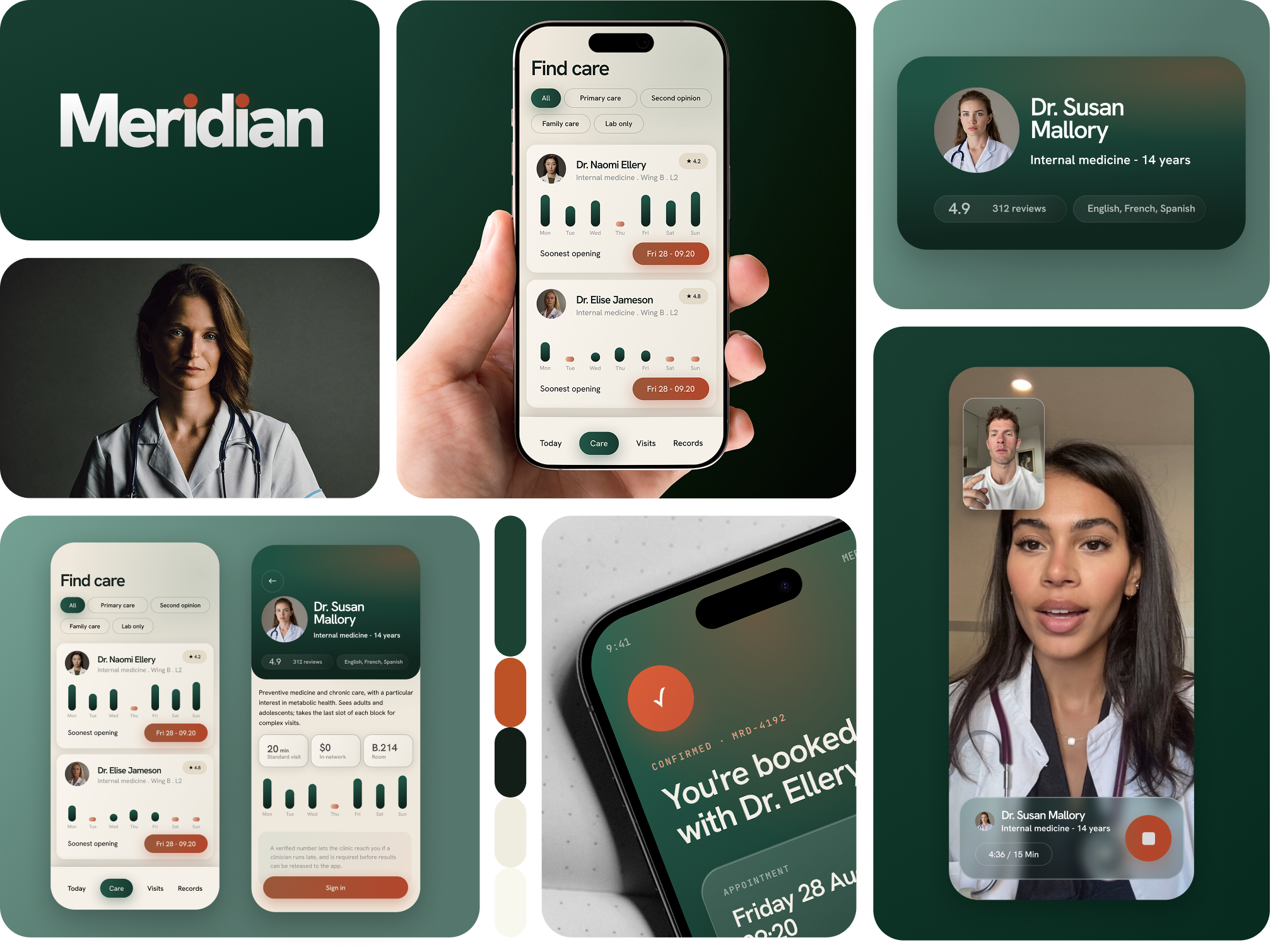

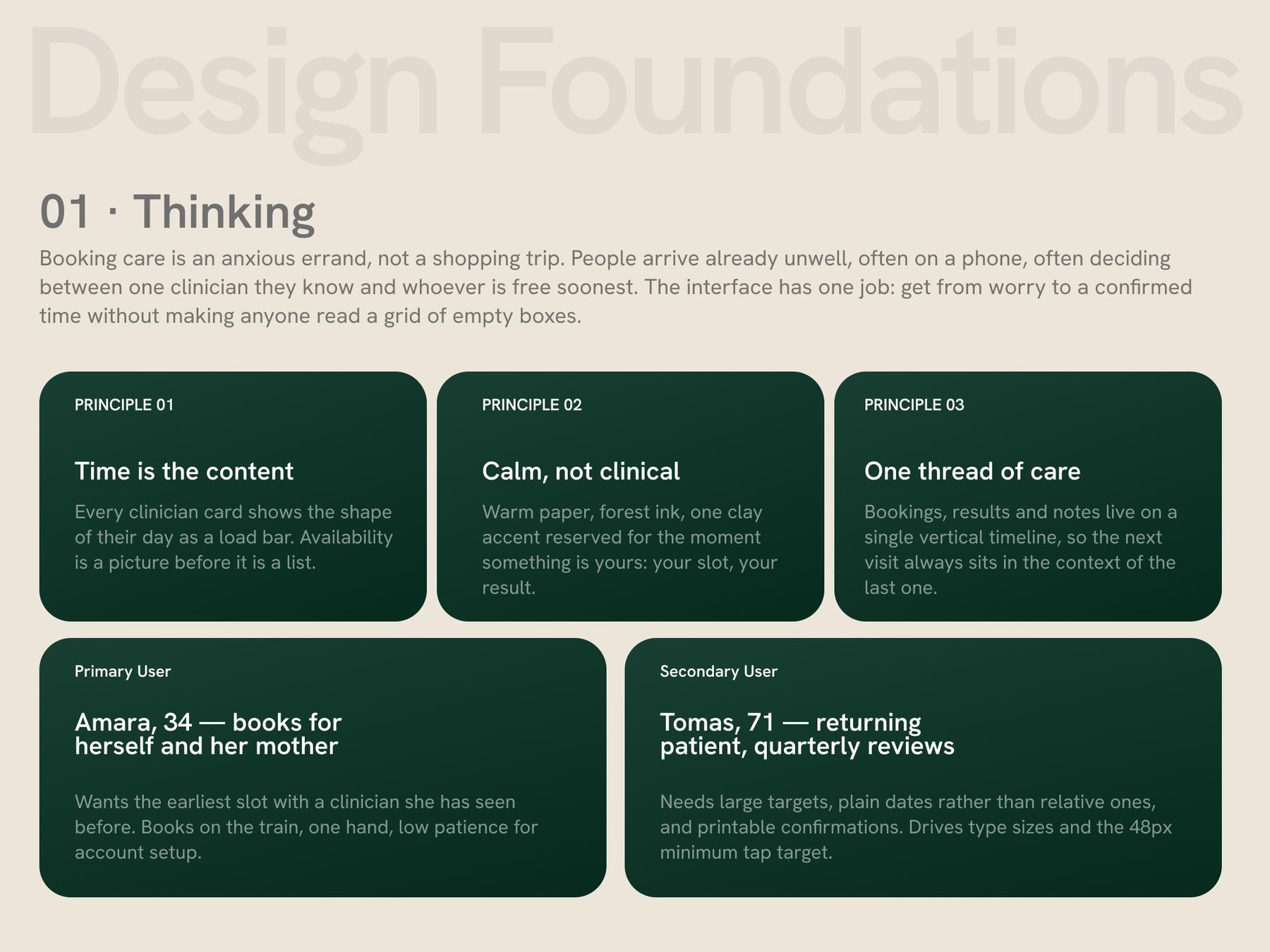
Booking care is an anxious errand, not a shopping trip. People arrive at the app already unwell, usually on a phone, usually deciding between one clinician they know and whoever is free soonest. Most patient portals answer neither question: they present a month grid of empty boxes, a directory sorted alphabetically, and a wall of tabs that hide the visit history that would give any of it meaning. The clinic's own framing of the brief was narrower — "make booking faster" — but the friction sat upstream of the calendar. Patients could not tell whether a clinician had any realistic availability without opening five profiles, and once booked, nothing in the product acknowledged that a visit is one moment in a longer relationship.
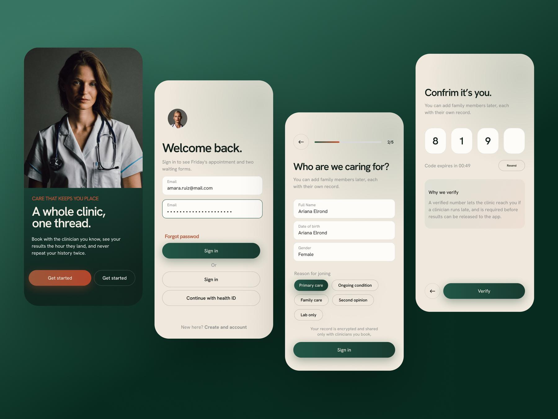
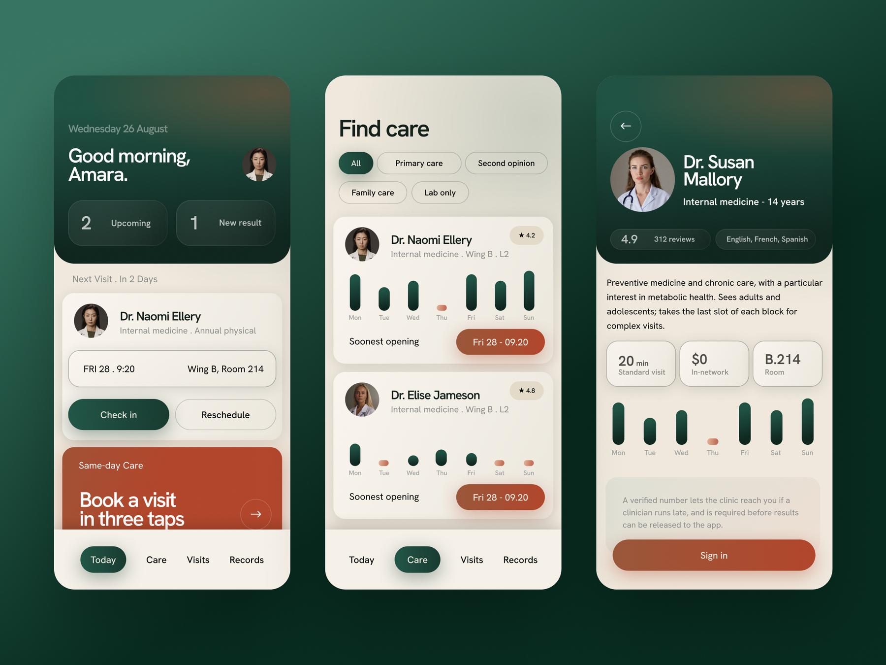
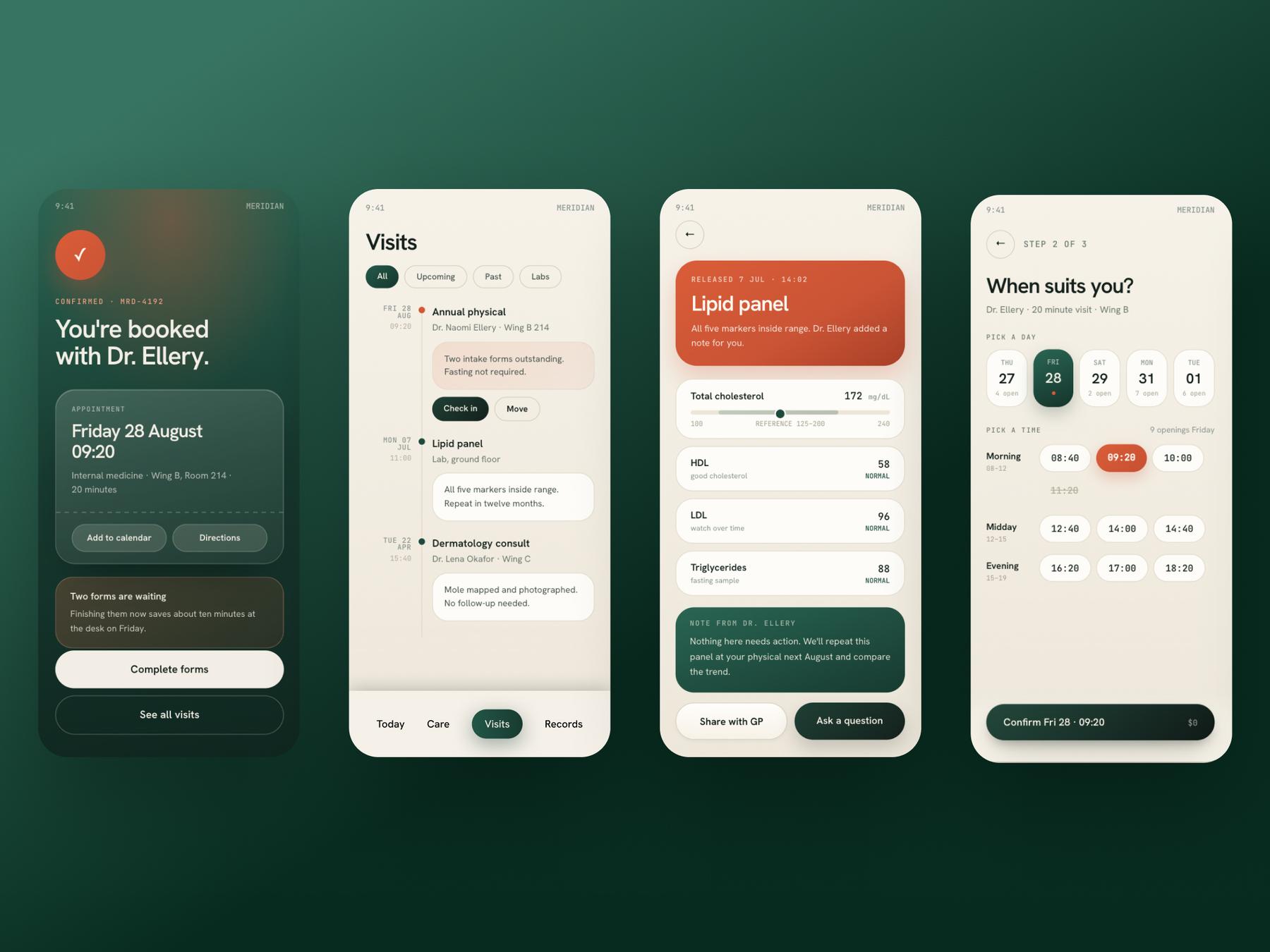
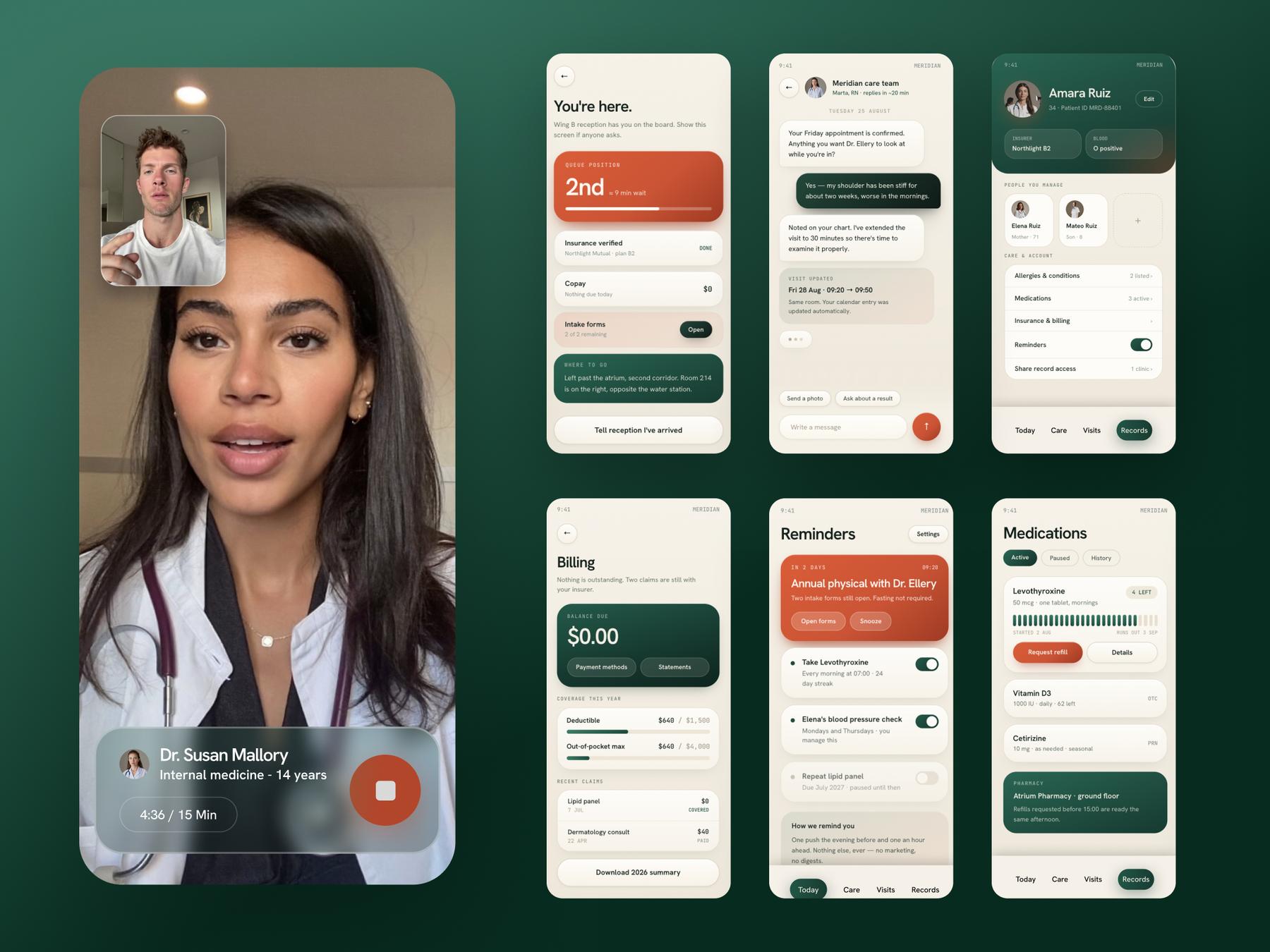
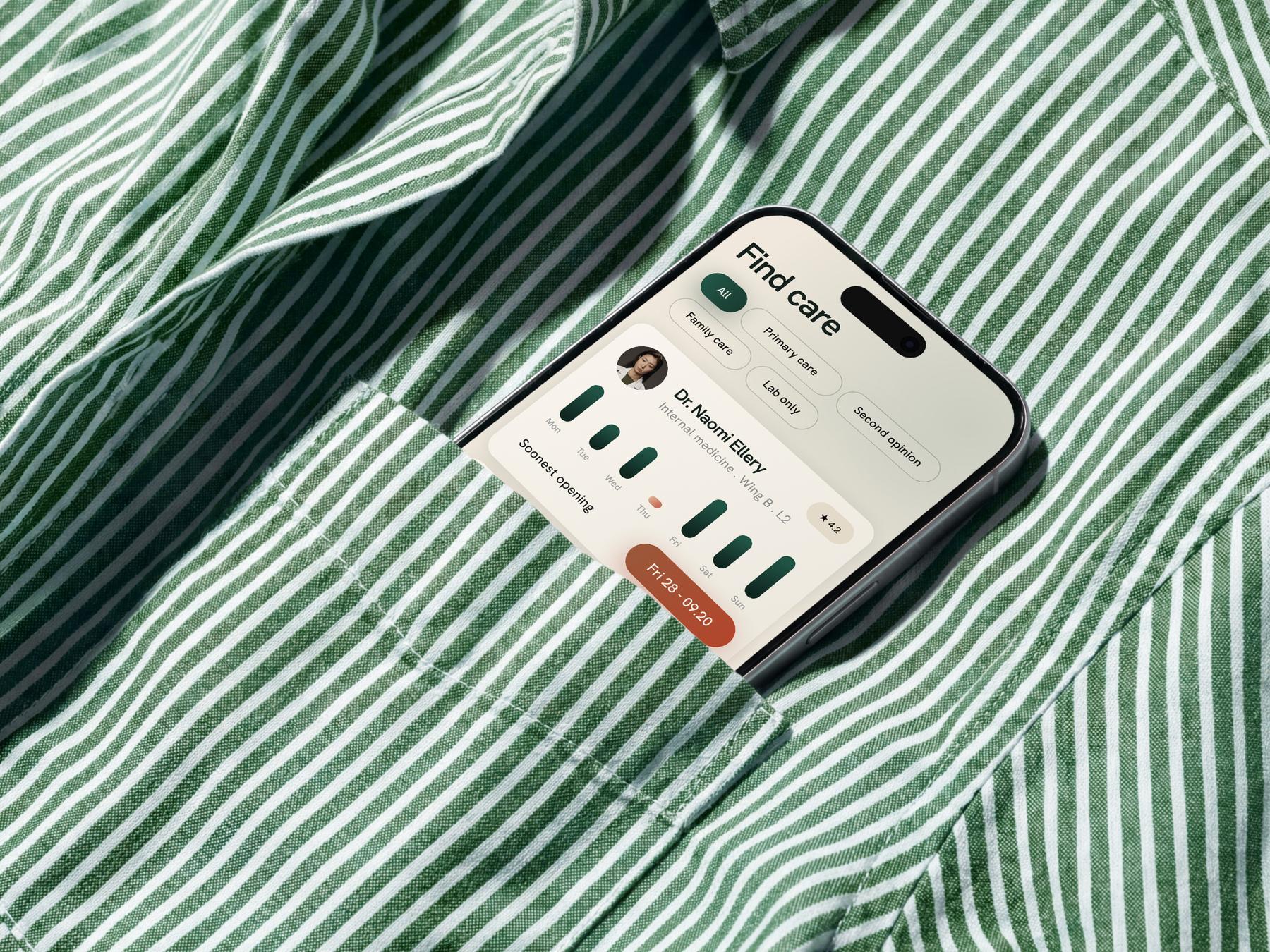
Most of the system falls out of three calls made early. Each one had a plausible alternative that a lot of health products have chosen instead. 1 ) Time is the content, so availability became a picture. 2 ) Warm paper and forest ink, not clinical blue. 3 ) Every action is a pill; rectangles are surfaces.
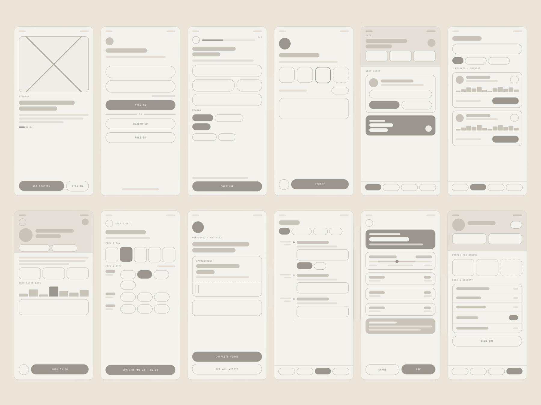
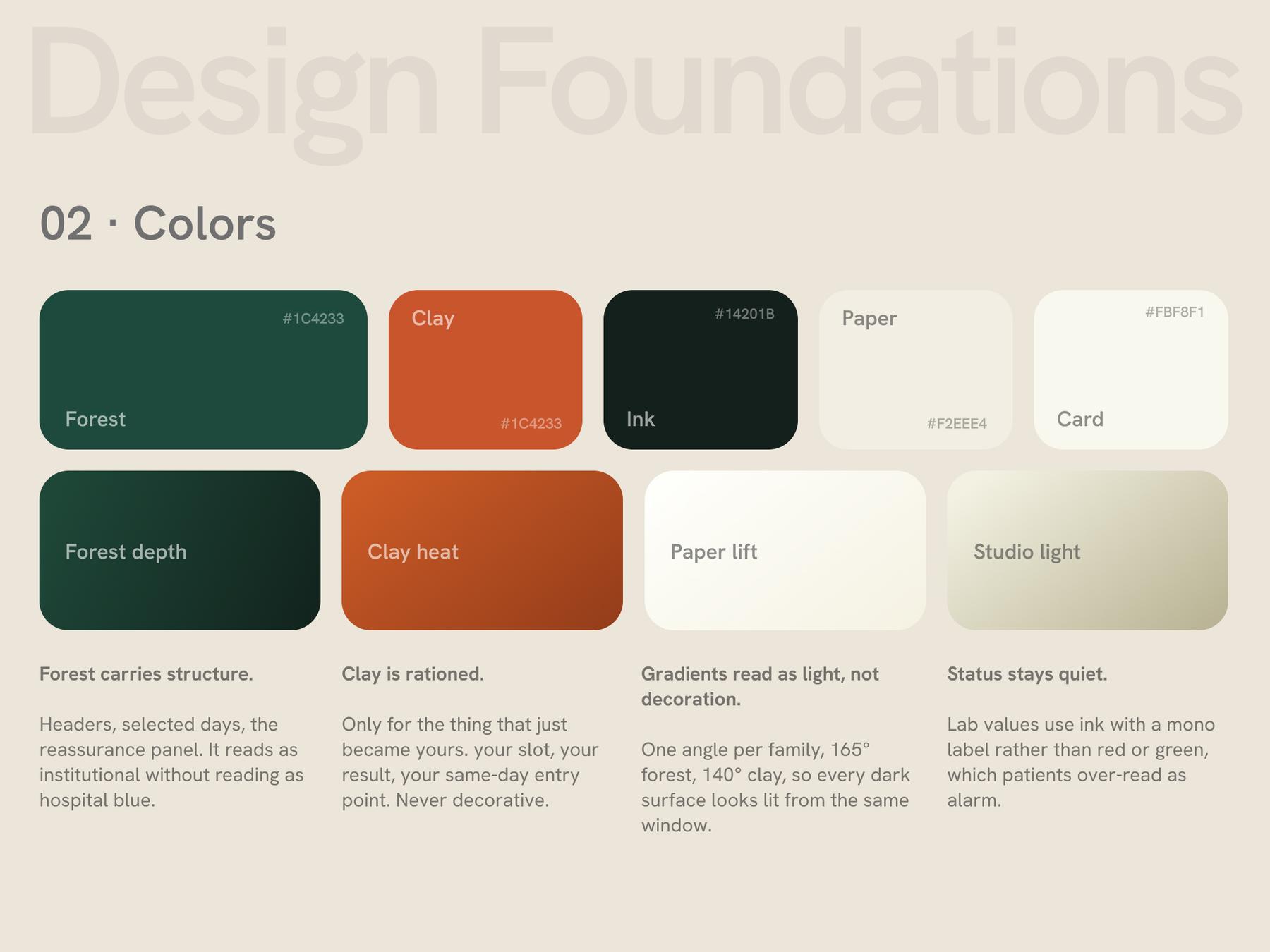
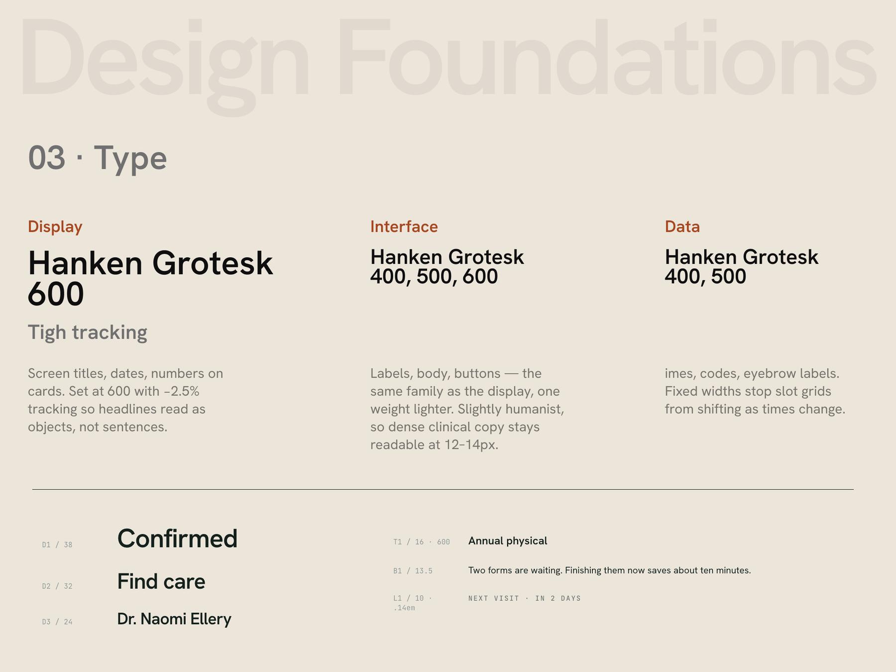

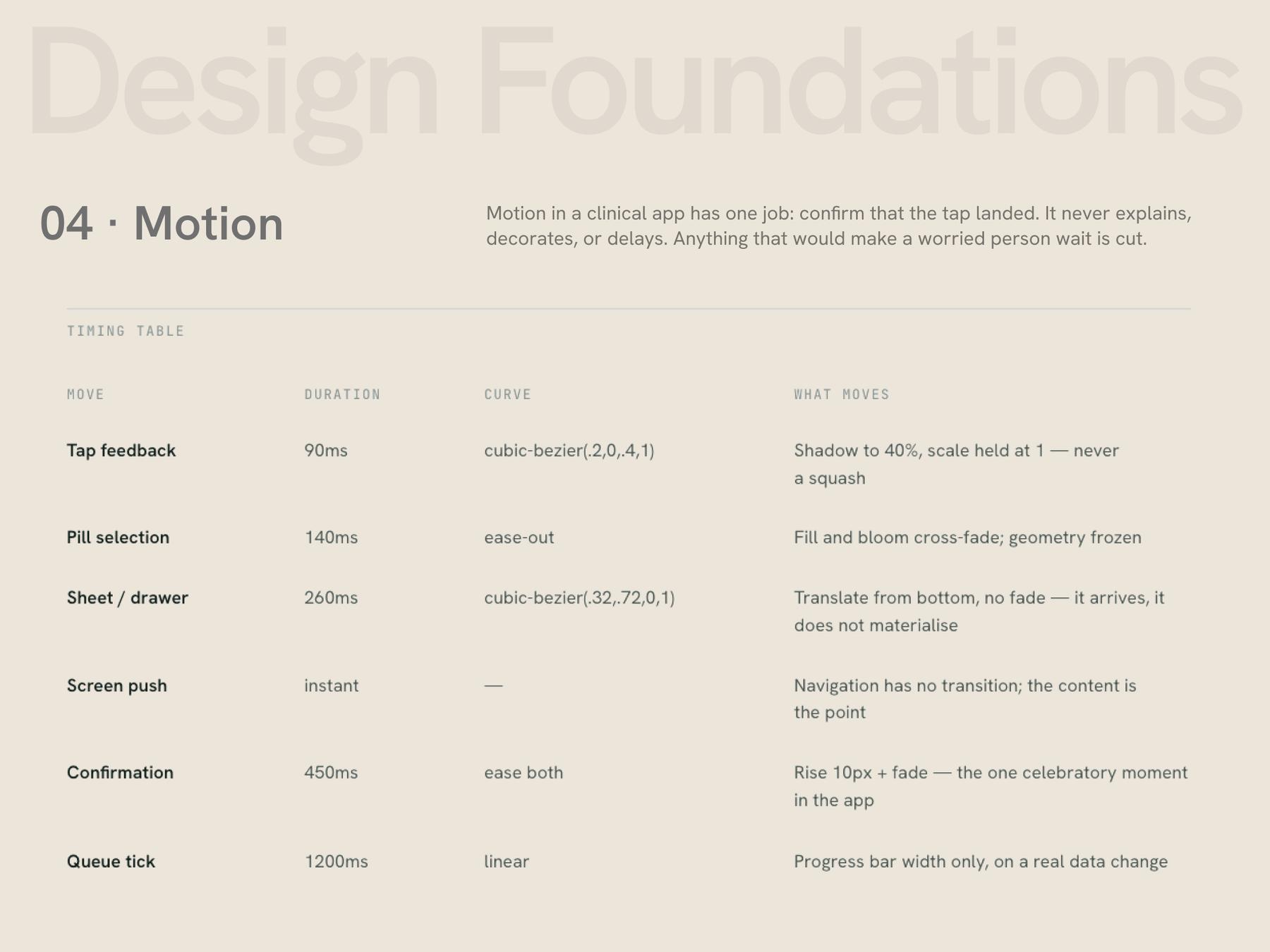
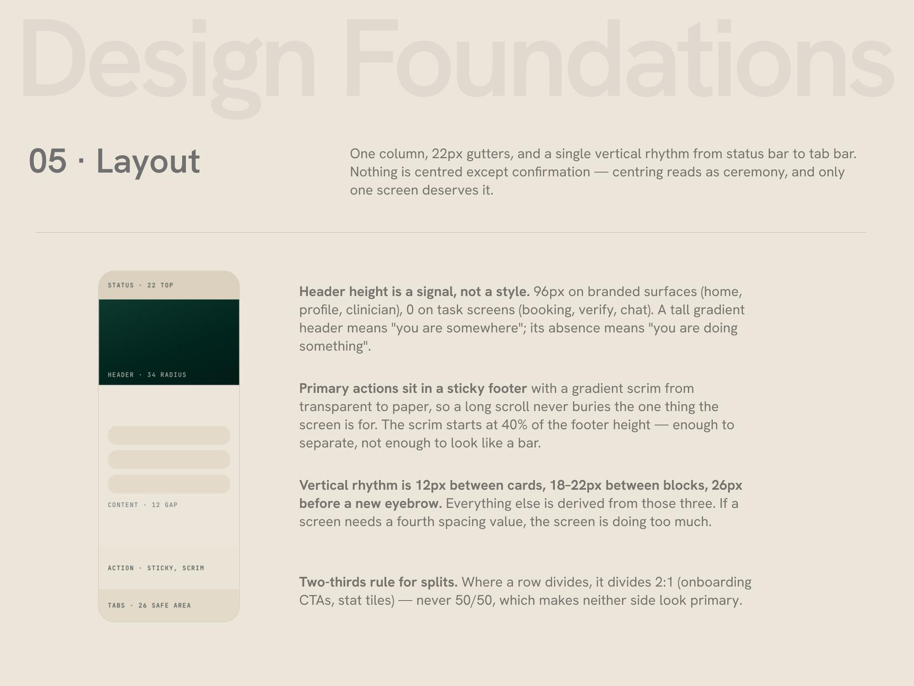
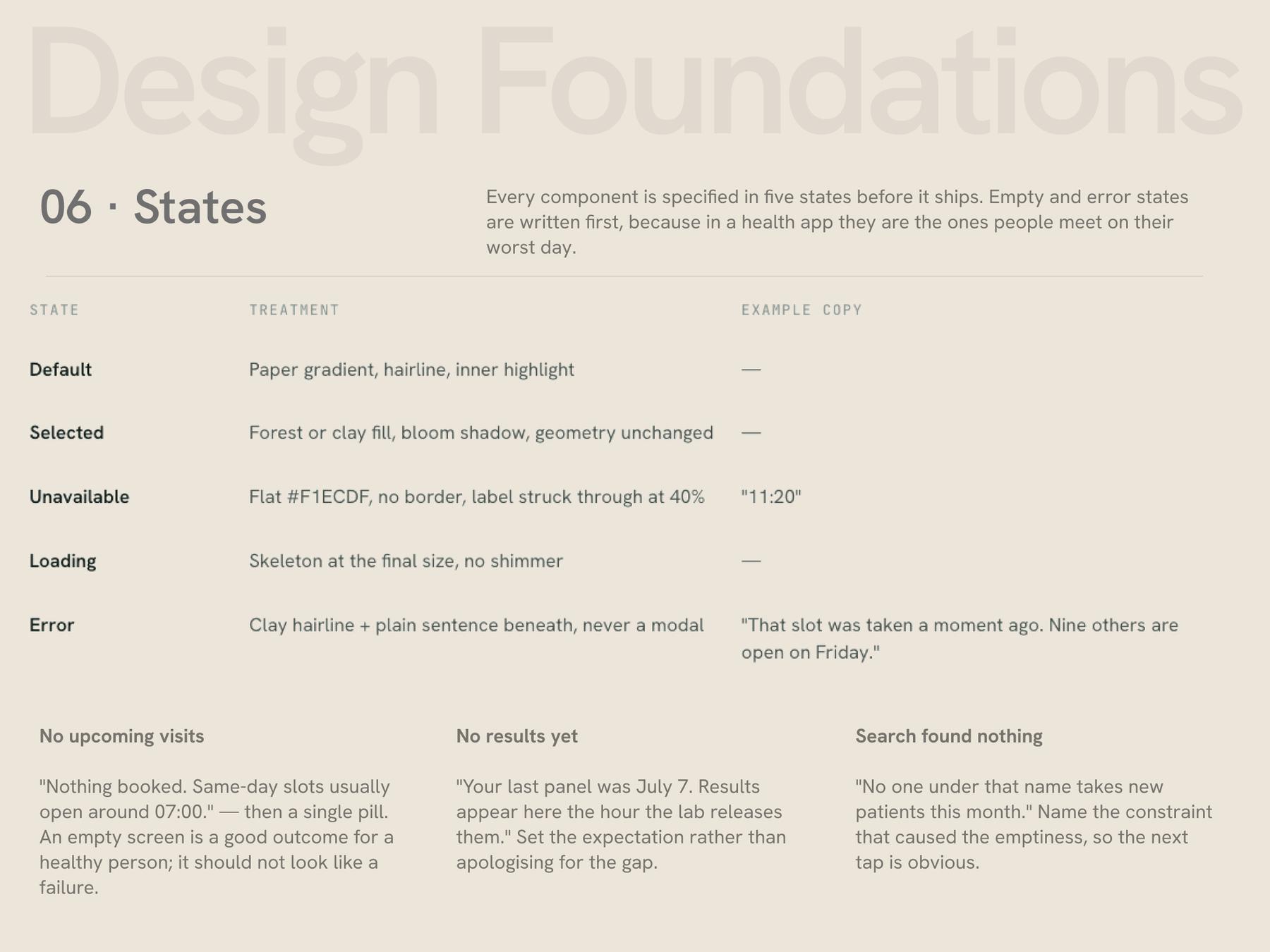
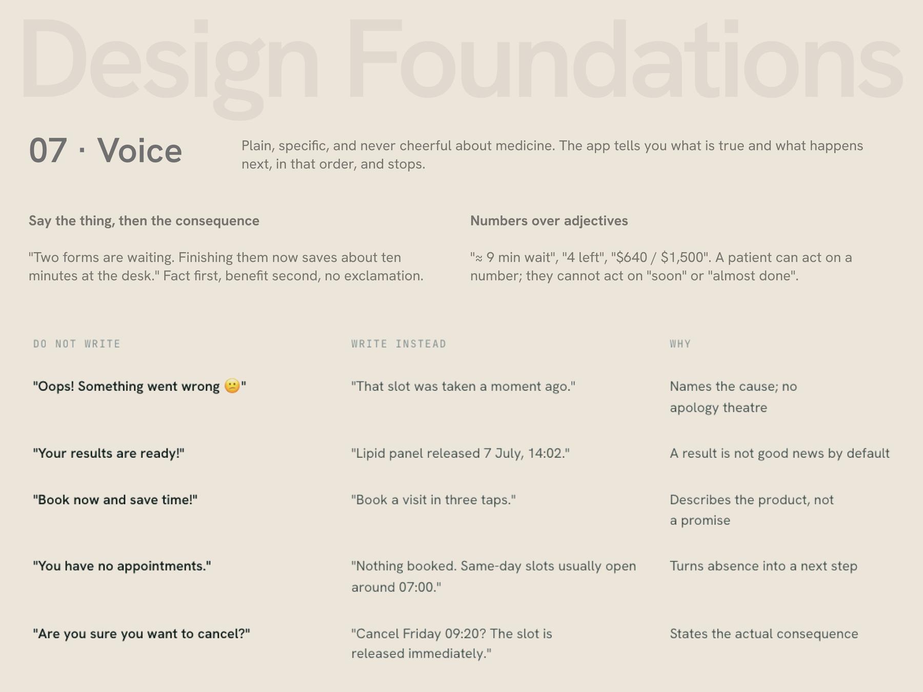
Eighteen screens across five journeys, wireframed in greyscale first so the structure could be argued about without colour in the room, then built as an interactive prototype and a flat board.
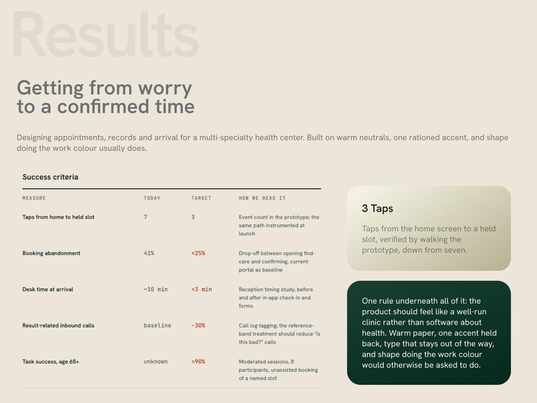
This work is at hi-fi prototype stage. The numbers below are targets and the instrumentation plan agreed with the clinic before build — not measured outcomes. Nothing here has shipped to patients yet, and no usability sessions have been run. Stating that plainly is more useful than a chart that implies otherwise. 3 Taps from home to held slot Event count in the prototype; the same path instrumented at launch Booking abandonment: Before: 41%. Now: <25% Drop-off between opening find-care and confirming, current portal as baseline Desk time at arrival Before: ~10 min Now: <3 min Reception timing study, before and after in-app check-in and forms Result-related inbound calls: −30% Call log tagging; the reference-band treatment should reduce "is this bad?" calls Task success, age 65+: >90% Moderated sessions, 8 participants, unassisted booking of a named slot. One rule underneath all of it: the product should feel like a well-run clinic rather than software about health. Warm paper, one accent held back, type that stays out of the way, and shape doing the work colour would otherwise be asked to do.